Money Wise
Project Role
UX Designer and UI designer
Duration
3 Weeks
The Project
Many young professionals in the UK struggle to build consistent saving habits because their financial lives are unpredictable, and most tools fail to adapt to fluctuating incomes, lifestyle pressures, and emotional spending triggers.
Many people struggle to stay consistent with saving because traditional budgeting tools feel rigid, overwhelming or guilt inducing.
The Challenge
How do I help young professionals in UK make more intentional and aligned spending decisions without overwhelming them or making them feel judged
• The Solution
Learning to make informed decisions with Money Wise
Money wise is a Budgeting app that understands real life. Flexible and non judgemental, it's built for how you actually spend.With Adaptive budgeting, it helps you to stick to your goals even when life gets messy.
Personalised budgeting that adapts to real life
Rewards that reinforce progress
Emotions that guide not punish
• Conclusion
Learnings and Future Plans
MoneyWise began just a few weeks ago (July '25) with one simple question: How can we make personal finance feel more human? Over the course of three weeks, I went through the full end to end design process diving deep into user research, synthesising insights, and building a product grounded in the struggles of young professionals trying to manage money without shame or overwhelm.
This project taught me the value of designing with empathy not just for users’ goals, but for their emotions, setbacks, and everyday decisions. While this is just the beginning, the journey so far has been incredibly rewarding and eye-opening.
I’m excited to continue evolving MoneyWise refining the experience, testing with users, and exploring how we can turn emotion aware budgeting into a truly empowering tool.
Future Plans
One of the most fulfilling parts of working on MoneyWise was uncovering the quiet emotional weight people carry around money shame, guilt, fear of judgment all of which rarely show up in traditional budgeting tools. Designing for those emotions, not just the transactions, reminded me that the most meaningful products aren’t always the loudest or most feature rich they’re the ones that make people feel seen.
What I’d love to explore further is how micro moments of emotional awareness a single journal entry, a supportive nudge, a quiet “you’re doing well” can compound over time to build trust, self-compassion, and lasting financial habits.
The challenge isn’t just in helping people spend less, but in helping them feel better about how they spend and that, I believe, is where design can genuinely shift behaviour.
Many young professionals and freelancers reported that traditional budgeting apps feel too rigid for their unpredictable finances. MoneyWise adapts to your lifestyle so you can stay on track, even when life isn’t predictable.
A measure of progress and rewarded behaviour
helps keep the user not only aligned with the goals
but more adaptive to the platform by introducing
positive reinforcement cycle.
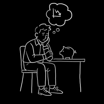
72% professionals reported that guilt and shame around
spending made them avoid budgeting altogether.
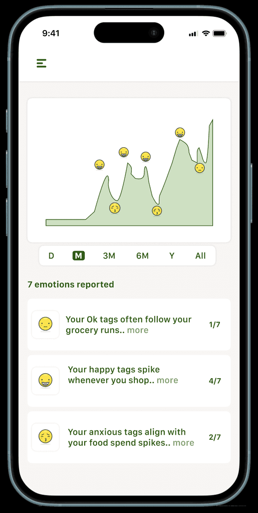
Money Wise helps you reflect on how spending feels,
not just what it costs.Building emotional awareness that
supports better decisions over time.
Thank you:)
You have reached the end… want to start another story?


Bridging gap between
intention and action
As the day wears on, mental fatigue sets in
making it harder to make clear, intentional
decisions.
I conducted interviews and sent out a survey, sampling the viewpoints young professionals had towards savings, how they made decisions about spending and saving, and what goals they had for their eating and spending habits.
•Research
Understanding the problem
My Research led me to few Patterns that guided
my direction
“Budgeting apps feel made for people with a fixed salary. I fall off every time my routine changes.”
Many shared that they felt traditional budgeting tools assume stable monthly income so when their earnings fluctuated, they felt like they were failing and eventually gave up, discouraged by rigid systems that couldn’t adapt.
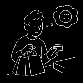
“Sometimes I buy stuff just to feel better. Then I feel worse after.”
Several participants described emotion driven spending often triggered by stress or boredom, especially after work. While it provided short-term relief, it was usually followed by guilt or regret. Many wished budgeting tools could help them understand these patterns without judgment.
“I open the app and there’s just… too much. I don’t know what I’m supposed to do next.”
Users shared feeling overwhelmed by cluttered dashboards and too much data in traditional finance apps. Without clear guidance, they didn’t know where to start. Many wanted a calmer, more focused experience that showed only what mattered in the moment.
From this I concluded
Rigid systems and emotional friction are getting in the way of better money decisions and healthy financial habits feel too hard to sustain.
these led to more hard hitting questions of how do I create
a solution that hits all these problems at their core
Combining HMWs with 5 Whys in order to come up with multiple high level objectives that don't just address the surface issue but solves for the core of the problem.
Designing Simple & Emotionally Rich Experience
•Design
I wanted to design something that meets users where they are not where they “should be.” A tool that offers structure and softness. One that says, “Let’s try again,” not “You failed.”Adhering to set of product constraints helped me set a focused approach:

App is not
•Reducing shame, cognitive load, and overwhelm around money
•Supporting irregular income and real-life unpredictability with flexible budgets
•Providing a safe, private, and calm space to reflect on your finances
•Shaming users for “bad” spending or missed check-ins
•Providing investment advice, wealth tracking, or long-term portfolio planning
•Providing a safe, private, and calm space to reflect on your finances
Explorations in Design
Product and design decisions are embedded in every element on the interface. While the journey involved many iterations, there are three moments where intention and empathy came together in a way that deeply shaped the experience. I’d like to share those with you.
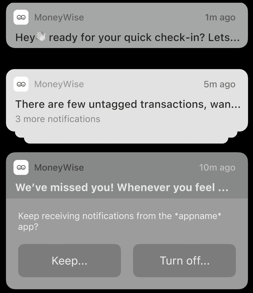
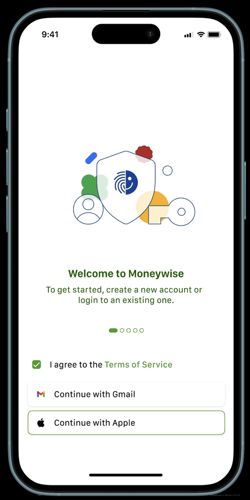
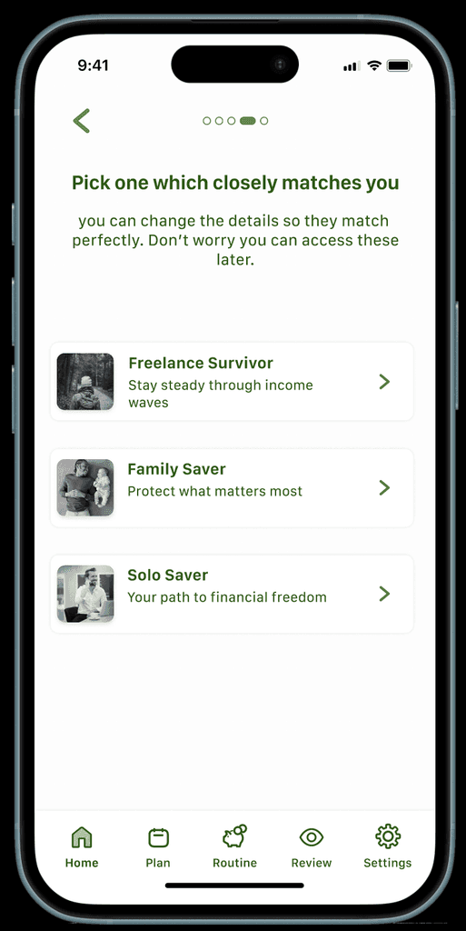
Testing and research reported that fintech apps often have long and tiring onboarding flow asking ton of questions which leads to people dropping off. Here I iterated and ended up with 4 screens while making the last step a sandbox like tutorial to keep people engaged all while helping them learn how to get most out of the app.
This screen was designed to reduce friction and emotional overwhelm by combining spending insights with a calm, friendly interface. Users can view, reclassify, and reflect on transactions in fewer taps using expandable categories and swipe gestures. The clean layout prioritises clarity over clutter, while the illustrated mascot softens the experience of financial reflection. We intentionally traded dense data views for speed, simplicity, and emotional ease.
I chose to make reporting emotion feature while swiping transactions as it closely tied them together while preventing the user to scroll endlessly to give out information which would increase cognitive load.
I went through a range icons on testing most of them were not understood on their own and i didn't want the user to find features on accident so I included what to do along with label above the transactions.
This screen uses a simple slider to let users rebalance their budget quickly, making the process feel flexible rather than restrictive. We focused on clear, relatable categories and a clean layout to reduce cognitive load. While we traded off granular control, the goal was to make adjusting plans feel intuitive and guilt free.
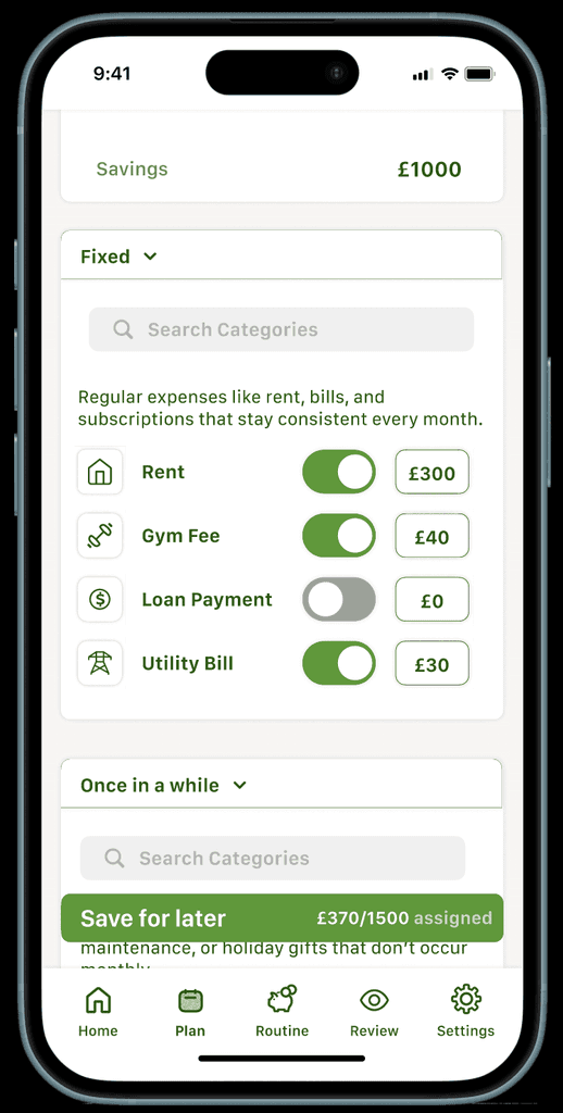
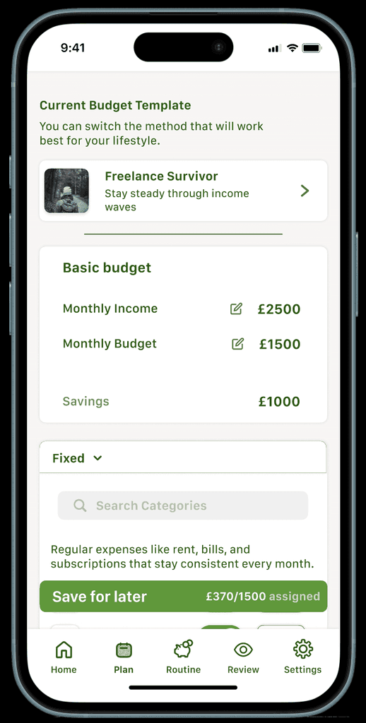
This budgeting flow supports flexible, real-life money management especially for freelancers by separating fixed, variable, and occasional expenses. The toggle layout allows users to “pause” payments without guilt, making budgeting feel more forgiving. We chose clarity over compactness, knowing that a calmer, step by step flow builds more trust. The goal was to reduce overwhelm and help users feel more in control.


App is
